
What is Right-to-Left?
There are over 7,000 living languages (I mean not programming ones), several alphabets, and different writing systems in the world. If you’re using English, you’re used to reading and writing from the left side of the page to the right. This is a Left-to-Right (LTR) text flow. However, several languages use Right-to-Left (RLT) scripts, including Arabic, Hebrew, Persian, Urdu, Yiddish, and others. Moreover, some languages are written in the top-to-bottom script (TTB). Some of them have LTR representation or use a mixed style (see examples below).
For UI designers and front-end developers, this means that in order to provide the RTL flow, the content of the website or app is mirrored (with some exceptions which are mentioned below). Not only is text switched, but also other elements like navigation buttons, breadcrumbs, animations, checkboxes, icons and so on.
For me, customising websites for Arabic or Hebrew language versions was a great lesson. I discovered how ethnocentric I was and how diverse the World Wide Web actually is. In this post, I’d like to share several techniques that will make the process of mirroring easier and less time-consuming.
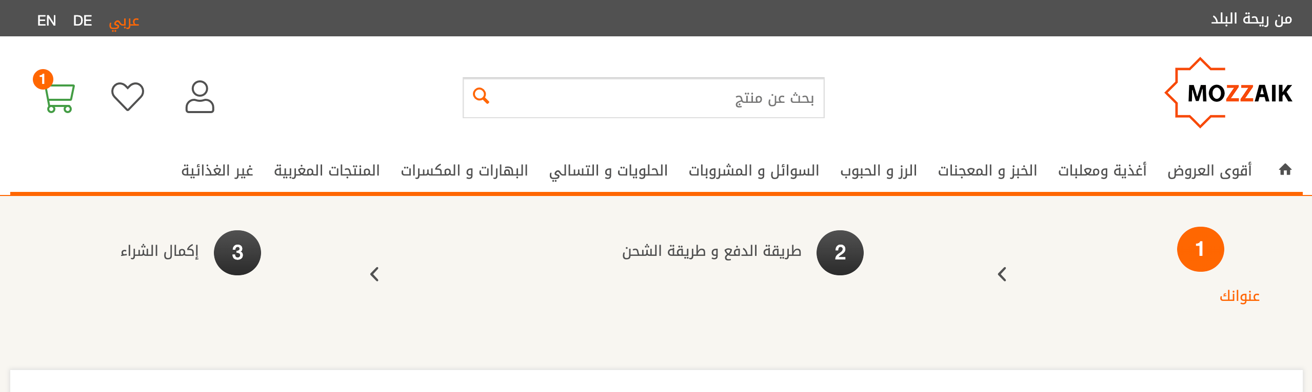
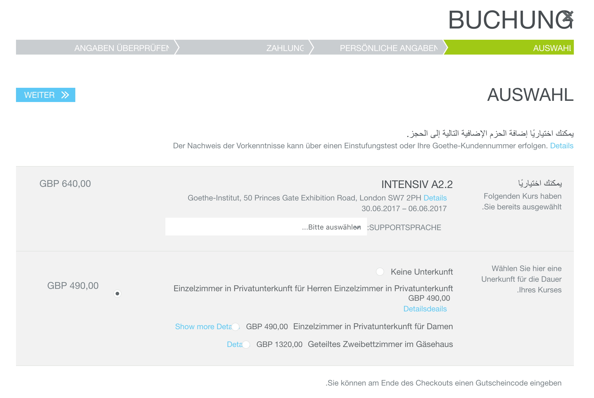
Source: https://www.mozzaik.shop/ar/checkout/shippingPayment
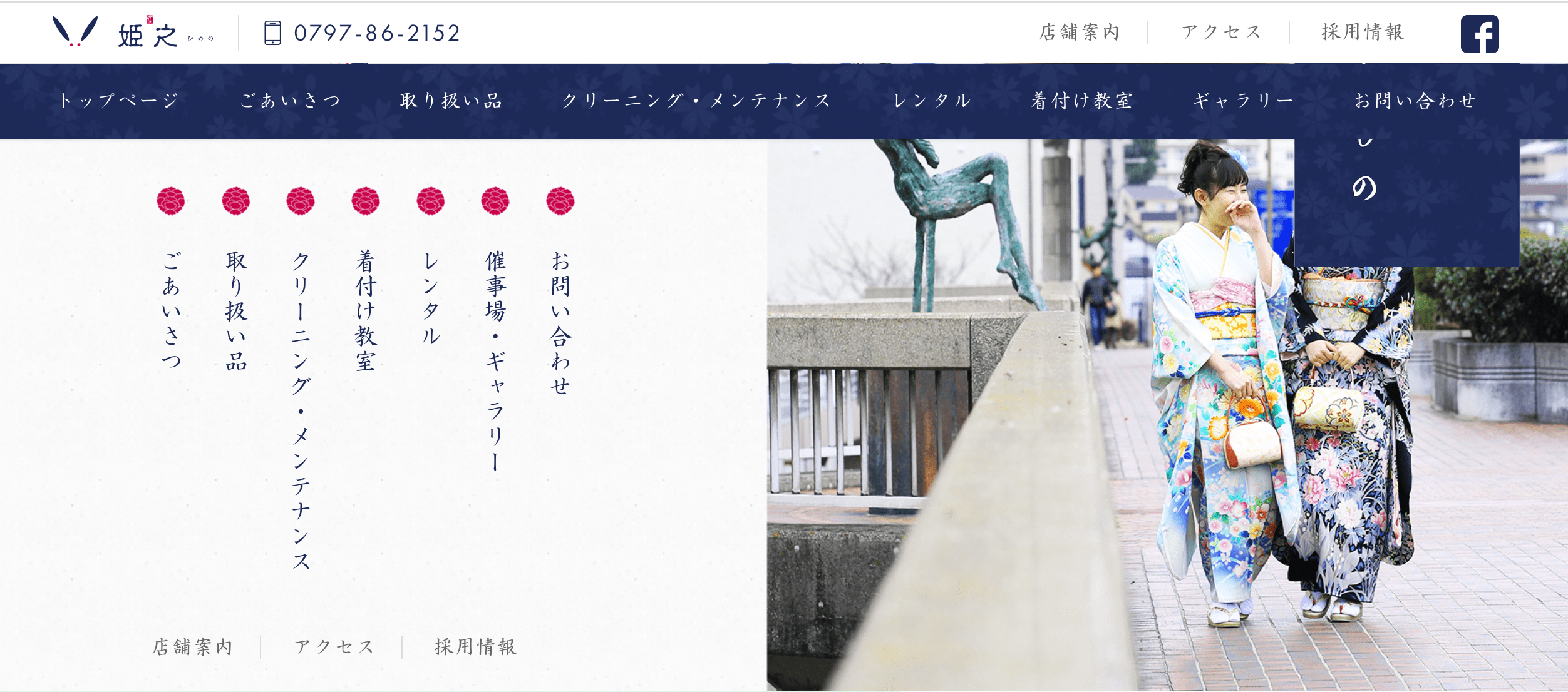
Source: http://www.baroku.co.jp/
Implementing bidirectional web apps
This is our example website. The goal is to switch it to RTL. So what is the first step?
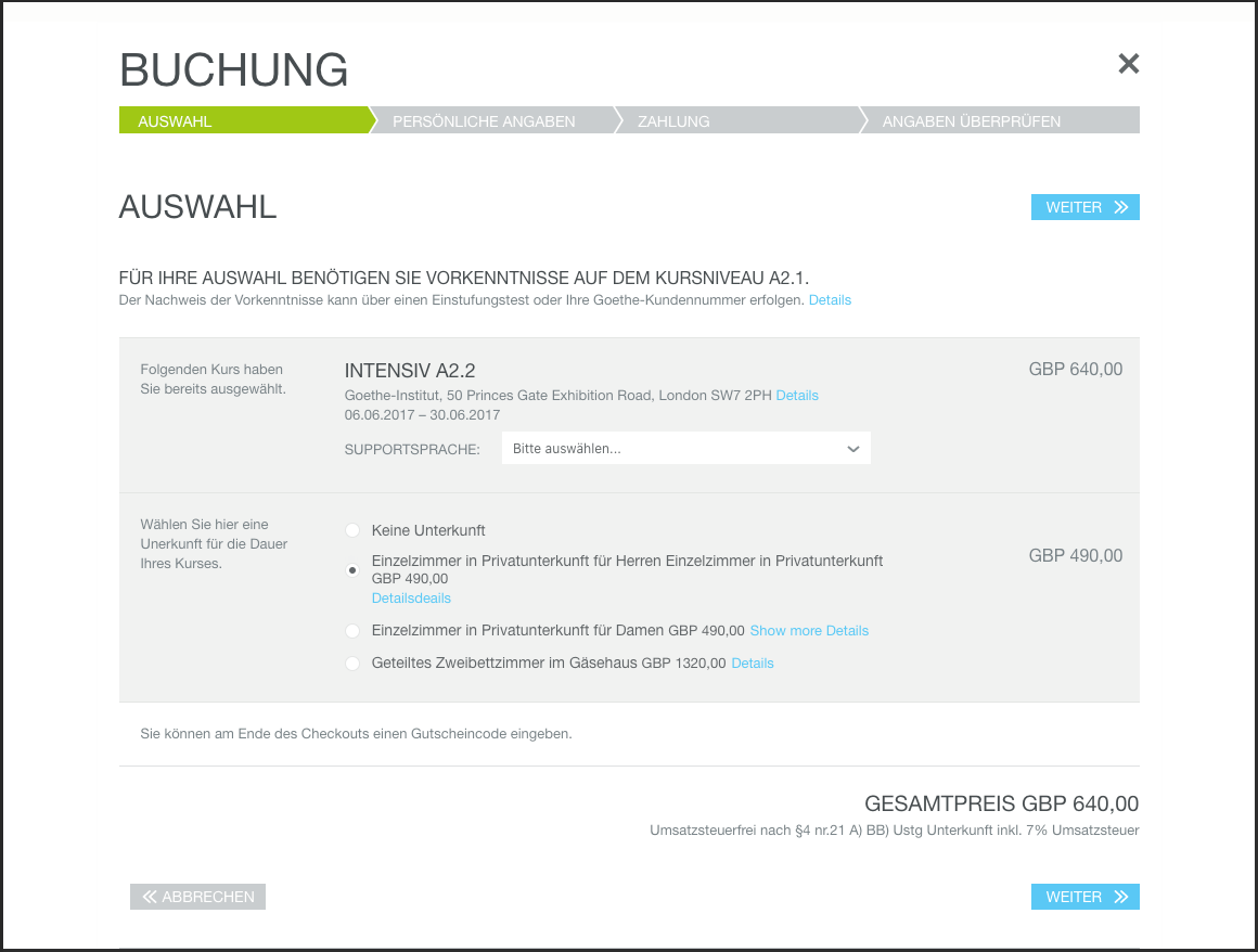
Theoretically, changing the direction of an existing website should be a piece of cake. There is a dedicated HTML attribute called dir. You simply add this code to the body element, and your whole page is mirrored.
That’s it? So what’s all the fuss about?
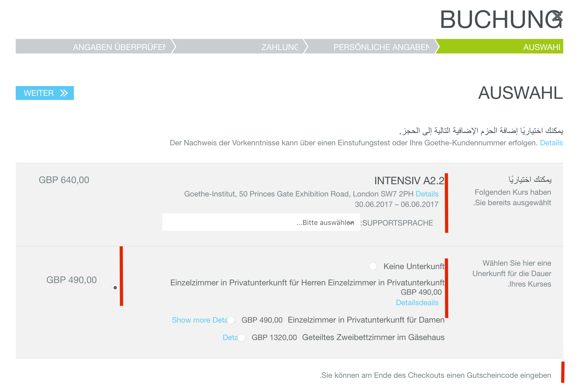
Let’s apply this attribute and see the outcome:
<body dir = “rtl”>
...
</body>
⚠️ Note: you may also use the value auto. It detects the type of script used on the page and adjusts it accordingly. This might be especially helpful with mixed language content and might solve truncation issues (“Hello Worl…” instead of “…ello World”). You can also apply the dir attribute to individual elements.
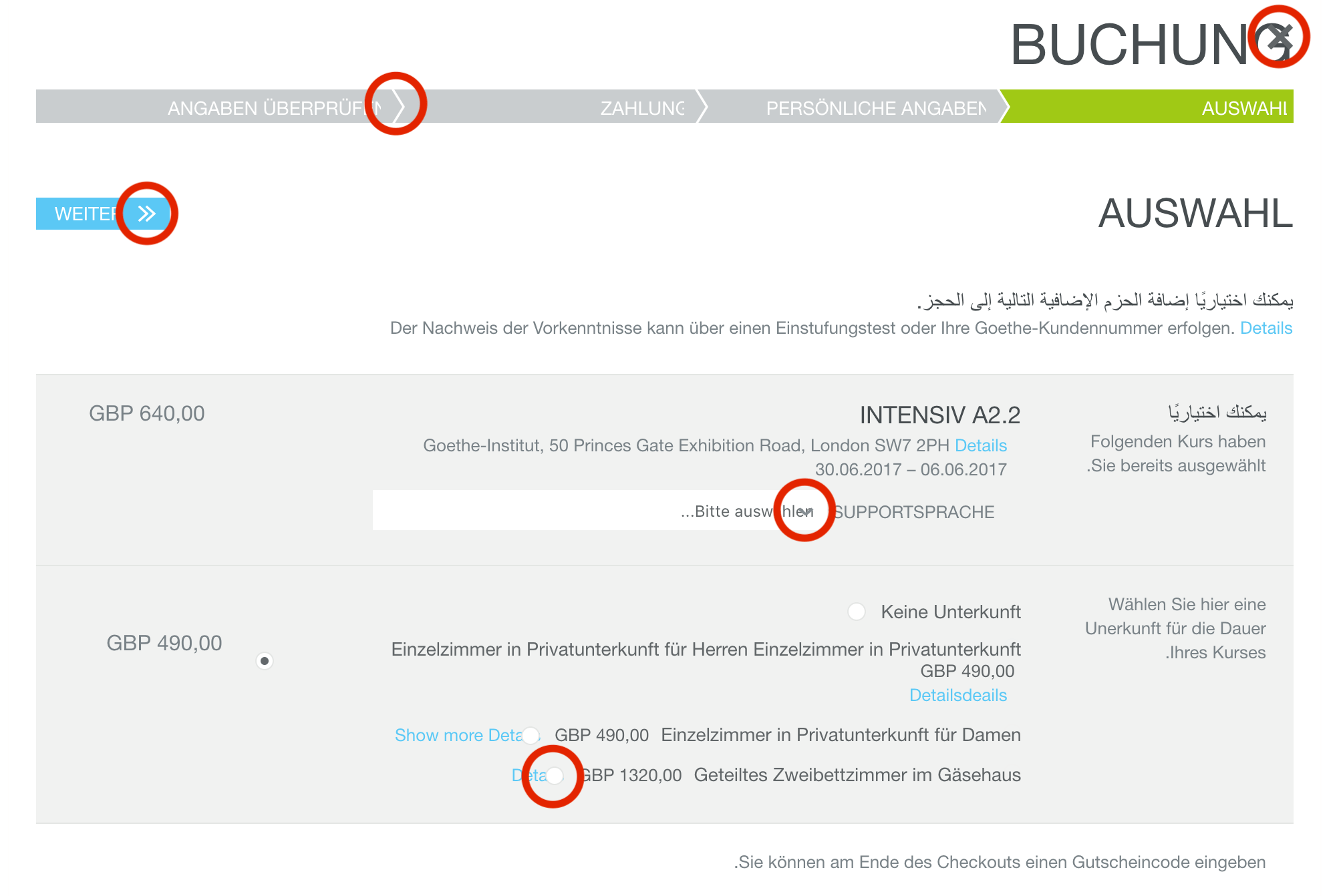
Take a look at the mirrored page. Are the styles appropriate? Notice the margins, paddings, icons, and some custom elements like radio buttons or progress bars. These issues are due to hardcoded values in CSS. At first glance, it may seem like a few minor changes. Nonetheless, there is a manual job to be done here, and you don’t want to make it the hard way by overwriting styles and creating even longer stylesheets.
Is there an easier way? 🤔
CSS Logical Properties
Here’s a big one: stop hardcoding paddings, margins, and borders! There is a better universal solution. Start using CSS Logical Properties!
I know that frontend developers’ first question is: „Wait, can I actually use CSS Logical Properties?”
Yes, all major browsers support them. 😉 IE, rest in peace…
Several years ago the flexbox and CSS grid were introduced. There are implemented properties like justify-content: flex-start/flex-end etc. As you can see, CSS gradually drops the concept of “left” or “right” and instead defines alignment with keywords like start, and end. Thanks to this flexbox, the CSS grid and now CSS logical properties automatically adjust to the direction of the page (LTR or RTL). This reduces the amount of code and allows you to switch between LTR and RTL effortlessly.
What does that mean in practice?
/* ❌ margin-right: 1rem; */
margin-inline-end: 1rem;

/* ❌ margin-left: 1rem; */
margin-inline-start: 1rem;

/* ❌ margin-top: 1rem; */
margin-block-top: 1rem;

/* ❌ margin-bottom: 1rem; */
margin-block-bottom: 1rem;

/* Shorthand for vertical axis */
margin-inline: 1rem;

/* Shorthand for vertical axis */
margin-block: 1rem;

/* The same applies to paddings and borders. */
It may be a bit tricky to remember these new properties, so let’s see this in a more visual way. Notice, that the inline represents the horizontal axis, and the block represents the vertical axis.
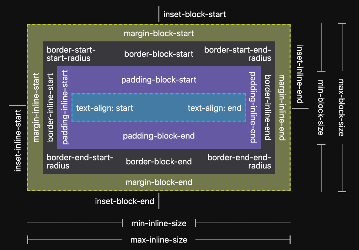
Logical Dimension
Additionally, CSS allows applying logical properties to sizing elements, so they can be applied properly in all writing modes. In the table below, you can see physical properties and their logical equivalents. Note, that new values are not interpreted yet in the media-queries syntax.
| Physical property | Logical property |
|---|---|
| width | inline-size |
| max-width | max-inline-size |
| min-width | min-inline-size |
| height | block-size |
| max-height | max-block-size |
| min-height | min-block-size |
Positioning
Relative or absolute positioning can also be declared as a logical property. In this table, you can see physical properties and their logical equivalent.
| Physical property | Logical property |
|---|---|
| top | inset-block-start |
| bottom | inset-block-end |
| left | inset-inline-start |
| right | inset-inline-end |
| top and bottom | inset-block |
| left and right | inset-inline |
The same principles of logical alignment are slowly introduced in text alignment, the background position or floats. Before using them, make sure your browser supports them.
Using mentioned techniques most of the page content should already be adjusted. However, there are some additional topics which should be addressed in order to create a better user and developer experience.
⚠️ Check CSS transforms declarations. There may be some elements or icons that require some manual adjustments.
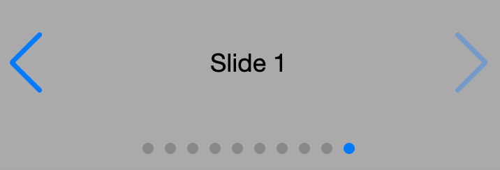
Animations and sliders
Apart from mirroring the look of the components, all animations should also be handled in a proper manner. As you can see on the slider screenshot, it’s presented in the opposite direction than in LTR sliders (the next slide button indicates the left direction). When choosing, for example, a slider or any other component library, take into account the RTL support. Swiper is doing a great job of this: to see a working example, click here.
Source: https://stackblitz.com/edit/swiper-demo-34-rtl-layout?file=index.html
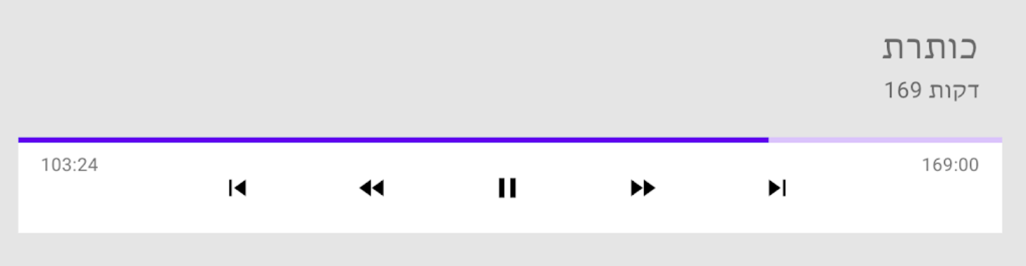
⚠️ Remember about exceptions: animated progress bars, including those indicating video or audio state, are not mirrored. Don’t mirror everything thoughtlessly!
Source: https://material.io/design/usability/bidirectionality.html#mirroring-elements
Calendars and numeric systems
Other interesting topics you may encounter while working with RTL websites are calendars and numeric systems. It’s good to remember that:
- There are multiple calendars used around the world. For example, This REST API helps convert Hebrew dates, which might be useful.
- There are no abbreviations for weekdays in Arabic. The design team also should consider this fact, especially on mobile devices.
- There are a few writing systems for expressing numbers used around the world, for example, Eastern Arabic numerals: ٠,١,٢,٣,٤,٥,٦,٧,٨,٩
It’s good to discuss these matters across the whole development team, especially with backend developers, to avoid unnecessary formatting and calculation problems.

Developer Experience: class names really matter
Aside from CSS techniques, I’m adding this straightforward point which might really save you and other developers a lot of confusion. As mentioned earlier, CSS gives up the right and left keywords. So you should too in HTML class names or JS variables.
Let’s consider the case of a component that has two columns. One column occupies 70% of the container width, the second one takes the remaining 30%. What’s the biggest mistake one can make in naming those columns?
❌ Don’t:
<element class=”element__column--right”></element>
<element class=”element__column--left”></element>
Can you imagine how confusing it’ll get when switching this to RTL? You don’t want to maintain code where the right becomes left, and the left is right. Trust me, I’ve been there…
What should you do instead?
For example, use the keywords main and side or start and end.
✅ Do:
<element class=”element__column--main”></element>
<element class=”element__column--side”></element>
Developer Experience: Generic class names
Another bad example is adding generic class names describing the element styling that doesn’t respect the RTL approach. For example:
❌ Don’t:
<element class=”mL0”></element>
The abbreviation .mL0 stands for margin-left zero. The situation gets even worse when this CSS style contains the !important flag. Avoid using such class names by all means. While writing your own libraries and code samples, keep in mind that they should be universal.
Conclusion
There are many more details in designing and coding universal apps suitable for both LTR and RTL. A great start is using CSS logical properties and avoiding keywords left or right in class or variable names.
Other details connected to UI design and development that are worth considering:
- Icons: not all should be mirrored. You can definitely learn more from this post: https://material.io/design/usability/bidirectionality.html#mirroring-layout
- Fonts: letter spacing, underline, and italic, text transparency, and line height may get troublesome. Checkout out this resource for more information: https://rtlstyling.com/posts/rtl-styling#handling-fonts
- Punctuation, truncation, parentheses: I encourage you to read a great article written by Spotify engineers: https://engineering.atspotify.com/2019/04/right-to-left-the-mirror-world/
- Mobile design and menus: https://www.smashingmagazine.com/2017/11/right-to-left-mobile-design
- Examples of top-to-bottom flow: https://adrianroselli.com/2019/11/css-logical-properties.html
- More on CSS Logical properties: https://elad.medium.com/new-css-logical-properties-bc6945311ce7
Educate yourself and your team, so the solutions may be applied early on. I really encourage you to get familiar with additional resources. They cover many more corner cases one may encounter on a journey to provide a great experience for users who use either LTR or RTL scripts. Lastly, share what you’ve learned with others!